In Progress High
UX/UI
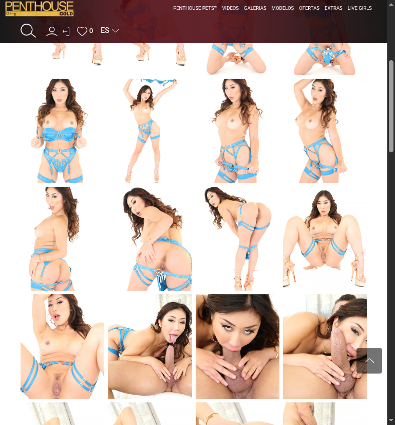
Main navigation menu PROBLEMS (member)
Task Description
❌ CRITICAL NAVIGATION ISSUES:

VISUAL PROBLEMS:
├── Icons too close together (no spacing)
├── Cramped user interface elements
├── Poor visual breathing room
├── Hard to click on mobile devices
└── Cluttered appearance

HIERARCHY PROBLEMS:
├── Mixed content types at same level
├── "PENTHOUSE PETS" specific vs broad categories
├── "DEALS" promotional mixed with content
├── "LIVE GIRLS" external service mixed with owned content
└── No clear primary/secondary structure

UX ISSUES:
├── No visual hierarchy indicators
├── All items appear equally important
├── Missing hover/active states
├── No dropdown submenus
├── Poor mobile experience likely
└── Confusing navigation logic

CONSISTENCY ISSUE:
├── Public site already has your own proposal hierarchy structure
├── Members area doesn't match public navigation
├── Inconsistent user experience between sections
└── Should follow same navigation pattern as public site
Propolsal
https://penthousegold.devscope.top/?page_id=224
✅ QUICK FIXES NEEDED:
├── Add proper spacing between all icons/elements
├── Match navigation hierarchy from public site
├── Use same menu structure as public version
├── Group related content together
├── Add visual hierarchy (primary/secondary)
└── Improve mobile touch targets


Menu issue on table, font-size, etc

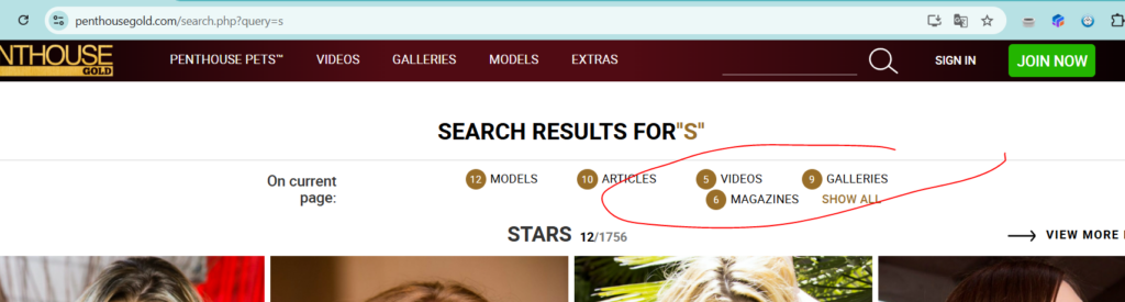
On search, fails the filter
UX/UI Progress
23
Total
0
Done
2
Active
7
High Priority
Task Information
Status:
In Progress
Priority:
High
Category:
UX/UI
Author:
eduardo
Created:
August 5, 2025
Modified:
January 14, 2026